
Histogram#
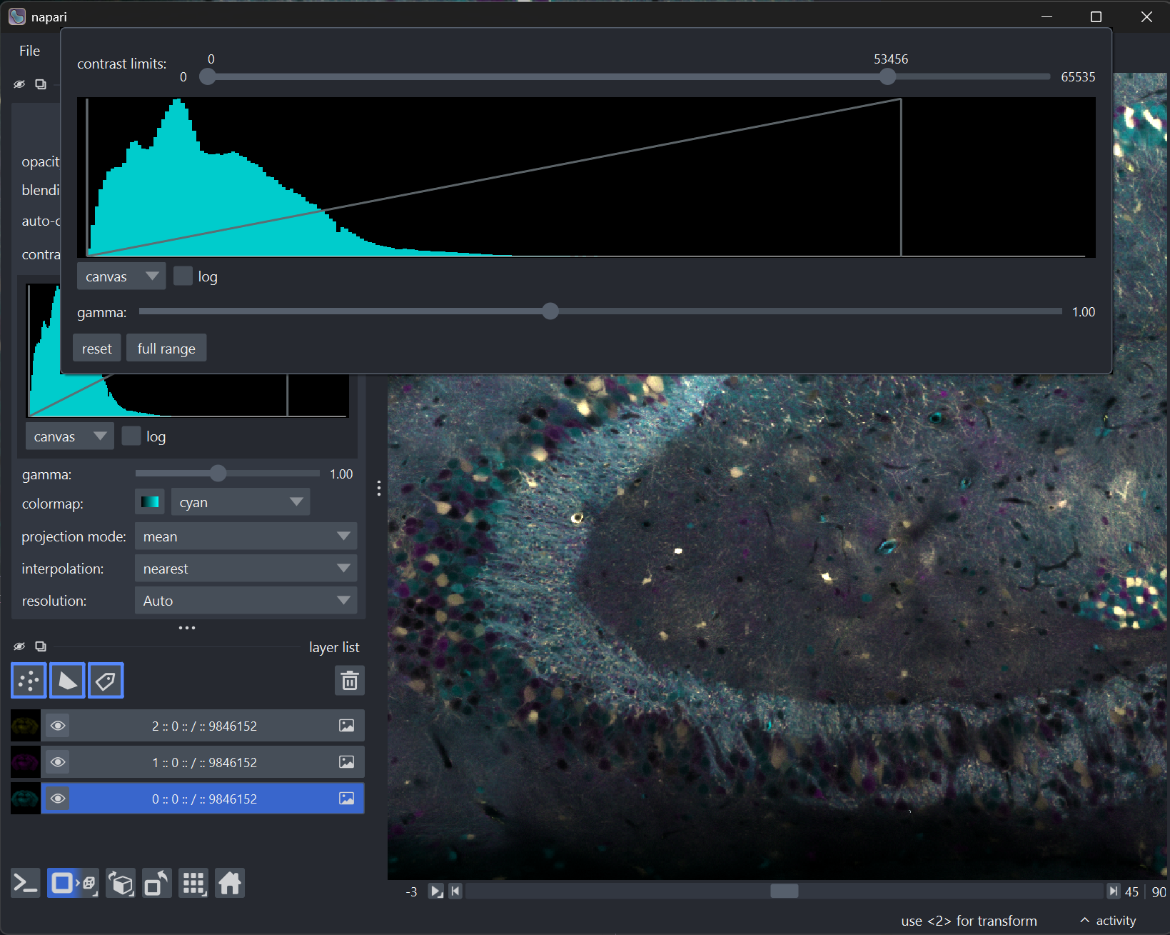
The histogram in napari shows the distribution of pixel values in an
Image layer. It helps you understand the intensity
range of your data and make informed decisions when setting contrast limits,
gamma correction, and colormaps.
Accessing the histogram#
Each image layer has a histogram button next to the contrast limits slider. The button has two interactions:
Left-click toggles the histogram inline, directly in the layer controls panel.
Right-click opens an advanced histogram popup window with additional controls for contrast limits, gamma correction, and reset options.
Note
The histogram is computed lazily — it is not created until you first access it, either by clicking the histogram button or by right-clicking the contrast limits slider. This means there is no performance impact until you intentionally enable it.
Reading the histogram#
The histogram plots pixel intensity values on the x-axis and the frequency (count) of each intensity value on the y-axis.
Bars: Each bar represents the number of pixels falling within a given intensity range. The bar color comes from the layer’s colormap (sampled near the bright end for visibility).
LUT line: A unified overlay combining contrast limit indicators and gamma correction into a single visual path. The vertical boundaries mark the current contrast limits, and the curve between them shows the gamma correction being applied. This makes it easy to see how your contrast and gamma settings affect the visualization.
Canvas vs Full mode#
The histogram can compute from two different scopes of data, controlled by the mode dropdown below the plot:
Canvas mode (default): Computes the histogram from only the currently displayed slice. This is fast and reflects exactly what you see in the viewer. When you scroll through a z-stack or time series, the histogram updates to match the current slice.
Full mode: Computes the histogram from the entire dataset. This is useful for getting a complete picture of your data’s intensity range, especially when the visible slice does not represent the data as a whole.
Log scale#
For data with a wide dynamic range — where most pixels cluster in a small portion of the intensity range — the log scale option can make the histogram more readable. It applies a \(\log_{10}(count + 1)\) transform to the y-axis, making low-count bins more visible alongside high-count peaks.
Histograms with large data#
napari’s histogram is designed to work efficiently with datasets of all sizes:
Slice data (canvas mode): The histogram is computed from the data already loaded into the canvas for rendering. This is always fast, regardless of total dataset size.
Full mode with numpy arrays: For in-memory arrays, the histogram randomly samples up to 1 million data points by default. This provides an accurate representation of the intensity distribution without processing every pixel.
Full mode with chunked data (dask/zarr): For chunked arrays, the histogram randomly selects a subset of chunks proportional to their size, then loads and processes them one at a time, accumulating the histogram counts along the way. This avoids loading the entire dataset into memory. The entire computation runs in a background thread, so you can continue interacting with napari while the histogram is being calculated. The plot updates progressively as chunks are processed.