NAP-5 — New logo (2022)#
- Author:
Juan Nunez-Iglesias <jni@fastmail.com>
- Created:
2022-09-08
- Resolution:
- Resolved:
2025-03-26
- Status:
Withdrawn
- Type:
Standards Track
- Version effective:
0.5
Abstract#
This NAP proposes a new, mathematically-defined logo for napari.
Motivation and Scope#
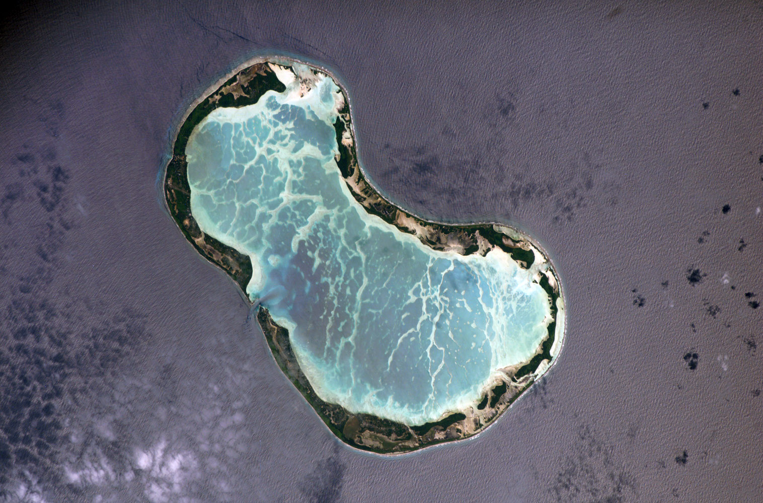
The original napari logo was simply a square crop of this image of Tabuaeran, the island containing the village of Napari — the namesake of this project:
A few months later, Jeremy Freeman, then director of Computational Biology at CZI, and a bit of a design nerd, traced the island and gave us our current, stylised version of that image.
![]()
Being, the shape is very irregular — no one knows what it is — and the gradients, the border around the logo, and the slightly rounded corners on a very square shape all look dated in 2022.
This NAP deals specifically with the shape of the logo. It proposes specific colors for each logo element but is not strongly opinionated on them — they can be decided in the implementation phase, and perhaps in subsequent NAPs.
Detailed Description#
This proposal keeps the original inspiration of the Tabuaeran atoll, which is quite beautiful and has the added bonus of looking a bit like a dividing cell. However, it goes much further in the styling.
The proposed logo draws the two “lobes” of the island as two touching circles, with the radius of the smaller (northwest) circle being a factor of \(\phi\) smaller than the larger one, where \(\phi = \frac{1 + \sqrt{5}}{2}\) denotes the golden ratio.
The “neck” of the island is also defined by two external circles: one smaller again by \(\phi\) than the smaller circle, and one larger again than the bigger circle. In this way, the island is defined by four circles of increasing radius, with each increase a factor of \(\phi\):
![]()
Additionally, the background of the logo is a squircle of degree 5, as Apple uses for iOS and macOS icons currently.
Overall, the new icon still keeps the “napari” character, while looking more modern, friendlier, and more abstract. This is an advantage for those who don’t know the origin of the logo, as they would still be able to appreciate the regularity of the shapes used.
Additionally, the logo looks quite a bit like a dividing budding yeast (S. cerevisiae), rather than an amorphous anonymous cell, which anyone with a background in biology would appreciate!
Here is the proposed logo together with the old one:
![]()
The new logo at 100% scale:
![]()
Implementation#
This is the fun bit. 😃
The logo proposed above is generated entirely within napari. It makes use of:
A Shapes layer for each element: the background, the sand, the rainforest, and the lagoon.
Scaling, translation, and rotation on each layer: the arithmetic for finding the exact centers and contact points of all the circles is much easier with the origin at the center of the north-west circle, a radius of \(1/\phi = \phi - 1\), and the island aligned along the 0th (vertical) axis. Similarly, the squircle is easier to draw with the origin at the center. I then apply scale, translation and rotation so that the island is at 45° and the logo fills the space in [[0, 1024], [0, 1024]].
NumPy for computation of all the lines and shapes.
Additionally, napari was used extensively during the development, to debug errors in calculating the contact points and so on. 😅
It’s very fun to work with powers of \(\phi\): \(1/\phi = \phi - 1\), which implies \(1/\phi^2 = (\phi - 1)/\phi = 1 - 1/\phi = 2 - \phi\), and so on. Similarly, \(\phi^2 = 1 + \phi\), which again lets you reduce all polynomials of \(\phi\) to degree 1.
The original implementation is at jni/new-napari-logo, but if this NAP is accepted, it would add the logo-generating script as a gallery example.
Another bit of mathematical fun: Veritasium calls \(\phi\) “the fiveiest number” (in this fantastic video): it is the ratio of the diagonal of a regular pentagon to its side, and it can be written as \(\phi = 0.5 + 0.5 \times 5^{0.5}\)! So it is a happy not-quite-coincidence that this is NAP-5. 😉
Backward Compatibility#
This NAP does not raise backwards compatibility concerns.
Future Work#
As mentioned above, this NAP is about the shapes of the logo, not the colors. The colors are sampled from Wikipedia’s satellite image of Tabuaeran, except for the lagoon, which is the turquoise of the napari-hub and napari sphinx theme. It’s kinda nice to have those match, but not necessary. We could change the color to be more natural (again sampled from the satellite) and update our themes to match. Or we could simply pick a more natural color for the lagoon, again from the satellite image, and forget about matching them.
I will take the opportunity to express two strong opinions:
I think some form of “ocean purple” is absolutely necessary for the background, as I think it’s become part of our identity on account of our existing logo.
Whatever exact colors we pick, I think they should continue to evoke the island: ocean, sand, forest, lagoon. There’s a lot of range in that space but I think we should keep to that constraint.
If anyone is keen to experiment with different colors I would be glad to pass the design baton over.
Other design questions:
Do we want a slight drop shadow? It is quite standard in macOS icons, and one looks quite sparse without it.
Do we want a sunlight reflection/sheen on the ocean part? I’m open to it.
For either of those, ideally, we would keep the image processing in Python and napari.
Alternatives#
We could of course go for a more traditionally developed logo. However, I think the mathematical story and the ability to generate the logo using napari are actually important. So I’d love to keep at least a large part of the concept for the logo, regardless of where this NAP lands.
It’s been suggested that the squircle shape might make it harder to tile a laptop together with other stickers, or align the edges. However, I think the tiling issue is a red herring because a quick look at the NumFOCUS sticker table shows that most related projects have irregularly-shaped stickers anyway. Additionally, I think that the squircle provides both a long enough straight edge (almost 1/3 of each side is exactly straight) to align things, but the smooth curvature makes slight misalignments perceptually harder to notice than a perfect straight edge.
At any rate, we can provide a variety of background shapes for different contexts anyway. I think the squircle shape is indeed more visually appealing than a square with rounded corners thanks to its “curvature continuity.” If we prefer a straighter edge, we can easily increase the degree of the squircle.
Discussion#
This section will be updated with links as we discuss the NAP.
References and Footnotes#
Copyright#
This document is dedicated to the public domain with the Creative Commons CC0 license [1]. Attribution to this source is encouraged where appropriate, as per CC0+BY [2].